Responding To Readers' Questions With A Closer Look At The CBO Study On Income Inequality
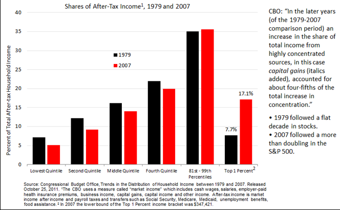
The Congressional Budget Office just released a study in which it concludes: “As a result of that uneven income growth, the distribution of after-tax household income in the United States was substantially more unequal in 2007 than in 1979: …” Here’s the sensational first slide presented in CBO’s 63 page document.
.png)
Shares of after-tax income going to the highest 1 percent of the population more than doubled over the 1979-2007 period, while shares going to each of the lowest quintile to fourth quintile declined, as you see in this chart.
While I trust that CBO has done the arithmetic correctly, it’s the way in which they set up the study that bothers me. In fact, I think their conclusion is extremely misleading. A cynic might say it represents a clear manipulation of the study’s beginning and end points in order to achieve a desired outcome. Why? Because the study’s start-year, 1979, followed a flat decade for stocks whereas the study’s end-year, 2007, followed a more than doubling in the S&P 500 from 2002 to 2007 – and capital gains included in the 2007 after-tax income figure probably represent most of the increase in the top 1%’s share-of-income from 7.7% to 17.1% between 1979 and 2007. I say “probably” because CBO doesn’t provide the actual cap-gains figures for either 1979 or 2007, but they do say this: “In the later years (of the 1979-2007 comparison period) an increase in the share of total income from highly concentrated sources, in this case capital gains, accounted for about four-fifths of the total increase in concentration.”
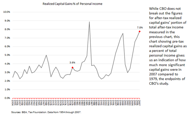
While CBO does not break out what portion of after-tax income was comprised of after-tax capital gains in their “share of after-tax income” slide, above, the following chart showing pre-tax realized capital gains as a percent of total personal income (pre-tax) gives us an indication of how much more significant capital gains were in 2007 compared to 1979, the endpoints of CBO’s study.
The increase in the top 1%’s share from 7.7% to 17.1% provides the basis for the dramatic 278% income growth in slide 1, which sort of reminds me of the “hockey stick” chart of climate debate fame. Had the study’s endpoints both been years of “normal” realized capital gains, the step up in share from 7.7% vs. 17.1% would be substantially reduced. Another key contributing factor to the top 1%’s increase in share was the Tax Reform Act of 1986, following which many C corporations converted to S corporations, whose income is substantially picked up in the top quintile.[1] So this contributor to the reported increase in share is really a measurement change rather than a change in substance.
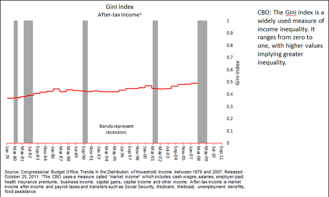
CBO’s calculated Gini index over the period reflects a modest increase in income inequality with a noticeable pickup from the recession trough in 2002 through 2007. Cap-gains and business income were the key contributors to that rise. Had the endpoint of CBO’s study been post- the last recession it stands to reason that an up-to-date Gini index would reflect a decline from 2007 in business income and realized cap-gains.
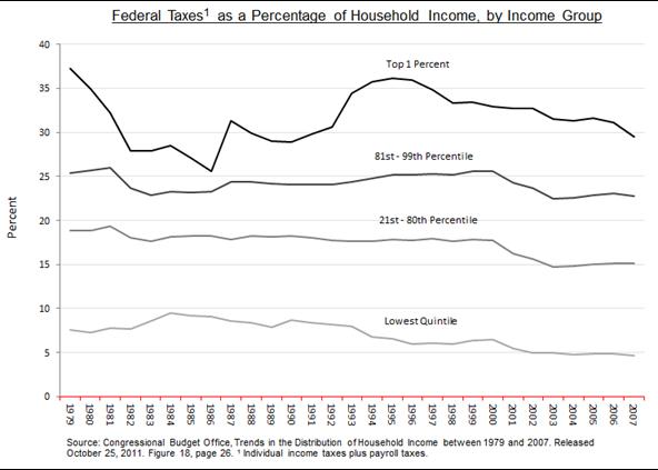
Finally, as for “millionaires and billionaires” paying their fair share of taxes, the CBO’s study actually shows a steady decline from 1979 through 2007 in total federal taxes paid as a percentage of household income by the lowest bracket all the way up through the 80th percentile. On this measure the system has gotten more progressive, not less. The top 1%’s taxes as a percentage of income significantly rises and falls with business income and capital gains tied to moves in the economy and stock market.
Using CBO’s “hockey stick” slide to beat the drum on rising income inequality – and using that as an argument for higher taxes on millionaires and billionaires – may be expedient for politicians but the picture it portrays is grossly misleading.
This Website Is For Financial Professionals Only